


Have you ever asked yourself “How can I make my content more visual?”
No? Well, maybe you should.
In this contemporary world, just about everyone has some content that they’d like to share around and this high density of content makes getting noticed a pretty tricky game to master. So, it’s fairly important that you recognise and capitalise on the things that are proven to work in this business, and one of those magical keys to successful content marketing is visual assets.
As a part of our endeavour to make the whole design process simpler, quicker and way more productive for you and your business, we wanted to help lead you through some of the ins and outs of designing and working with visual assets to boost your content marketing strategy. So, let’s discuss.
Why Are More and More Businesses Investing in Content Marketing?
As of 2015, content marketing is expected to become the biggest and most important digital marketing trend for businesses. But why? What makes content marketing so special?
Content marketing concerns the publication of, well, content. This means anything from text, video, images, and everything in between.
A big factor that makes content marketing such a big element in modern brand maintenance is the fact that it allows your business to provide people with useful information. Many brands have taken to writing blogs, making informative videos, creating step-by-step guides, all of which provides handy pieces of information that each brand’s consumers have a hunger for.
A good example is Whole Food’s blog ‘Whole Story’, which posts regular recipes, information on the farming industry, guides to healthy eating etc. So, by producing engaging and informative content, Whole Foods are able to strengthen their ‘accessibly healthy’ brand, and also showcase interesting ways to use their products.
While ads still populate so much of the internet, TV, and magazines, and still do wonders for some brands, content marketing has gone on the rise thanks to the fact that it’s arguably less transparent than direct advertising.
Marketing content like this gives your brand a chance to adopt a much more personable and unique voice. Perhaps your brand can foster a highly satirical tone, like Old Spice do through all of the content on their social media pages, including their YouTube channel. By producing content, you’re able to make your brand appeal on a more humanistic level, talking directly to (and with) consumers about the things they care about.
By producing informative, tailored, and engaging content, brands are able to become go-to resources for consumers. If people are looking for a recipe, they might visit the Whole Foods blog, or if they’re looking for a laugh, they might swing by the Old Spice YouTube channel. Through content marketing, these brands become a part of people’s everyday life.
So, producing regular content that people want to see is a surefire way to boost engagement, web traffic and awareness of your brand.
But What Can Visual Assets Do to Help My Content Marketing?
These days, just about everyone markets some content, so many people have tapped into the idea that it’s a great way to stay relevant and noticed. But, thanks to this high degree of content production, it’s not as easy as just writing up content and hitting the ‘post’ button.
Chances are, whatever you post, someone else has posted (or will post) something similar, a similar joke, a similar blog post, a similar status update. So, how do you make your content stand out from the rest? You guessed it – visual assets.
Visual assets give you creative control over how your message is perceived. You can brand images, use certain colours or imagery to set a tone or emotion, present a recurring idea in a unique way, or just grab a whole lot of attention.
When you think about it, every text-based Facebook status, blog post or Tweet looks identical, so it’s very easy to scroll past a text-only piece of content without even reading it. One way to stop people from scrolling past is via a strong, effective and well-created visual asset.
Visual assets can help you create a strong presence for yourself online, both metaphorically and literally. Have a look at the diagram below, comparing two tweets – one with a visual asset and one without.
Try scrolling past that first Tweet without stopping for a look. That first Tweet with an accompanying visual asset has gained more retweets and favourites than the one without (in less time, as well!). This can in part be attributed to the fact that the use of a visual asset gives the post a much larger physical presence on followers’ Twitter feeds, so it grabs users’ attention quicker and more often.
By including a diagram that complements the article, Buffer is also giving users a sneak-peak into the content, and a brief overview of what to expect – aiding their understanding of the linked written content. And, if they think they can understand it from the get-go, they’re going to be much more receptive to the content.
So, by working visual assets into your content marketing plan, you can give the content you have worked so hard on a bigger chance to shine. Try to think of visual assets as a part of your content, just like grammar or tone of voice is a part of a blog post, a visual asset is just another part that adds to your content’s effectiveness as a whole.
So, Can I Post Just Any Old Picture to Accompany My Content?
Short answer: No. Long answer: No, and here’s why:
A good visual asset should be functional and purposefully created.
Why? Well, I’m glad you asked, there are two main reasons why you should take some time to create functional visual assets: to aid your audience’s understanding, and ‘the swipe factor’.
We’ll get into how and why specific visual assets aid your audience’s understanding a bit down the line, but to start off with, let’s run over the swipe factor.
Coined by content strategist Gregory Ciotti, the swipe factor is a more colloquial term to describe the memetic effect that most of us experience every day, where people take and share certain pieces of content around, often creating ‘viral’ pieces of content (memes). As Ciotti notes, while memetics can apply to any medium, like videos, songs or certain pieces of text, the most common and dominant format is images. This is where your visual assets come in.
Ciotti says, “While the odds of a company-created visual spreading like your typical internet meme is somewhere between ‘zero’ and ‘never going to happen,’ the swipe factor of well created visuals is still quite relevant, especially for content marketing purposes.”
So, while the chances are that your company’s bar graph or pie chart isn’t going to go viral any time soon, if you produce a well-crafted and well-used visual asset, it will likely get picked up, shared, and linked back to your brand and work, creating a smaller, more niche, but still as effective form of virality.
In short, if you take the time to create a unique, well-designed and functional visual aid to your content, it will likely be shared, thus creating awareness about and traffic to your content.
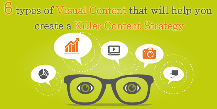
What types of visual assets are there?
The main aim of the visual asset game is to create visual cues that complement the information you’re trying to present – be that a product, a service, some data, a theory etc. Your goal in creating a visual asset is to make your information easier to understand, reference and digest. Think of when you are giving directions to someone, sometimes you might find yourself grabbing a piece of paper and pen and crudely sketching out roads and landmarks to help explain yourself and communicate clearer.
As was mentioned earlier, there are some specific types of visual assets that can communicate specific things. Obviously, not all are applicable to every situation, so it’s important to know what you’re trying to communicate, who you’re communicating to, and what visual aid is the best.
To make it all that much easier for you, let’s break down the common types of visual assets and what they can do.
Photos
It’s near impossible to deny that photos dominate a decent chunk of our day-to-day. We take them, view them, share them and constantly make meaning from them.
There are countless ways to integrate photographs into your marketing strategy, all of it depending entirely on your brand. Whether you photograph a retail product you may sell, photographs of the people you interview to accompany the write-up or perhaps some photos of the team behind your company, finding some way to introduce photos can put a face to names/brands and engage your audiences.
For instance, consider content-based websites, be they pop-culture news, humour, political, general interest etc., on the homepage of these sites, a majority of the links to the content will have an accompanying image of some sort.
For one example, check out all of the photographic assets from this one page article on The Guardian. There is a main visual asset of the portrait of the interviewee to give context to the write-up and a face to the name, there is another face-to-name portrait of the interviewer, and then advertised along the right are other article links with accompanying images.
Including these photographic assets contextualises the content and makes it more appealing and easy to understand, thus why sites like The Guardian use them so frequently across all of their social medias.
In fact, studies have suggested that articles with images get 94% more total views. Similarly, 60% of consumers are more likely to consider or contact a business when an image shows up in their search results, and tweets that include images receive approximately 150% more retweets than those without.
So, the proof is in the pudding; a well selected image can make a world of difference for your content marketing. Just another excuse to get a little snap-happy.
Charts
Charts are probably what a lot of people think about about when ‘marketing’ and ‘visual aids’ come to mind. Charts are enormously helpful when it comes to visualising data by helping to visualise numbers, identify relationships and use contextual clues to understand the information more concisely.
As Rand Fishkin notes, “(Charts and graphs) get picked up and used all the time by sources that want to quote the numbers and even by sources that originated the numbers that are looking for visual ways to represent them.” This frequency of sharing goes back to our discussion of ‘the swipe factor’, meaning the more your charts and graphs are circulated, the more likely people are to seek out the original source – you.
Lets look at an example by email service Mailchimp that uses charts well and with good reason. Also worth a quick note: this is me contributing to Mailchimp’s swipe factor, made possible by their use of well crafted and effective visual assets. See, it really does pay off!
This graph from Mailchimp data analyst Neel Shivdasani, compares the number of times people open or ignore emails from certain industries when the word ‘free’ is included in the subject line.
By creating a simple, easy to read and well-composed graphic asset to accompany his blog post on the findings, the data collected by Shivdasani is much more digestible, understandable and practically invites readers to share the data.
Consider your audience, and the fact that a lot of people want to get a rundown of the stats quickly and immediately. Graphic representations of data are a great way to give them the main facts nice and fast, and you are left to discuss what the data means etc in the accompanying text, if you like.
Remember: keep it simple, identify the main pieces of data you want to present, find a logical and interesting way to display that data and then execute it.
Visual Representations
Visual representations do exactly what you’d think: they are used to visually represent concepts. These are usually paired with a piece of text that outlines the concept or idea, and then the representation provides added clarity and a visual representation of that idea. Basically, the representationsshow you, while the text tells you.
Confused? Let’s consider a common example: origami. Nearly all origami instruction guides come with a visual representation, a picture, graphic, or diagram of each fold. Why? Because origami is tricky, and reading a big block of text that says things like “Fold corner A on a 75 degree angle to corner B and then fold corner B halfway down the page…” just makes it even trickier to execute for many people. So, an accompanying visual representation of these instructions that shows you exactly where corner A is meant to go just helps consumers’ understanding and clarity.
According to Neil Fleming, over half the world’s population are thought to be visual learners (65% to be exact), meaning that a majority of people understand and register information better when it’s visualised in some way.
Creating such a successful representation isn’t always the easiest thing in the world, though. Visualising complex ideas, especially theoretical ones can be tricky. Let’s look at an example that visualises a theoretical idea with a simple but very clever and well-executed representation.
This image by Gaping Void via Buffer is used to represent the difference between knowledge and experience. Buffer could have used hundreds of words to explain the difference between the two concepts, but a simple graphic has been used to visualise the idea in an instant.
Consider new ways to represent old ideas, and remember to try to keep that balance of showing and telling in order to make a really great piece of content and an equally as great visual asset.
Comics
Chances are we’ve all read a comic or two in our lifetime, so we are all familiar with the format. This is what makes comics such a valuable visual asset – the familiarity and accessibility of them.
Going back to the ‘swipe factor’ another thing comics have going for them is their popularity as a format. People associate the medium with a lighthearted tone and maybe a laugh or two. This expectation of humour paired with the visual nature of a comic makes it far more appealing to read if one pops up in your social media feed.
But how do we communicate complicated or theory-dense ideas through comics while still keeping it lighthearted? A good resource to have a look at is artist Grant Snider’s work. Check out this example by Snider where he uses a the comic format to lightheartedly and visually introduce and explain some elements of typography. By using humour and a fun format, Snider provides an easy way to understand a detailed topic.
Of course a comic is not the best visual asset for every company. A lighthearted and comedic tone isn’t always suited for every business, but when used correctly, in the right situation, a comic can be a wonderfully educational and effective asset.
Annotated Screenshots
Are you marketing content that involves tutorials or technical step-by-step guides? Perhaps you could consider some annotated screenshots. Annotated screenshots can help orient your consumer as well as give them contextual clues to solve issues quicker and easier.
Let’s consider software guides, an introduction to new software. A big block of text can lay out the instructions, description of tools etc. in a fairly understandable way, but ask yourself if a few annotated screenshots could possibly make the process a bit smoother for your audience and help them understand the content better. Consider the example below where we introduce the Photoshop toolbar tools. One example, to the left is a text-only explanation, whereas the example to the right includes an annotated screenshot. Which do you think is easiest to understand?
Chances are that while statistics suggest that most people will prefer the screenshot of the toolbar as an added visual to the guide as seen to the right. Though, some other people will respond better to the text-only approach. This is why many software tutorials use both text and visual guides. The aim of the game is to let the text and the visuals complement each other, ensure they don’t contradict but enhance and make further sense out of the directions.
Another benefit of a screenshot is that it avoids confusion by giving your viewers some visual context. Say somebody had their Photoshop toolbar set up differently to the discussed one, they would be able to recognise this thanks to the screenshot and figure out which tool is which. So, a few annotated screenshots can also save some confusion.
Remember: visual assets are meant to complement and enhance written information, they are not always meant to replace the information entirely, especially not if this hinders some people’s understanding of the content.
What about infographics?
Infographics are a fantastic tool, when done well, they can be engaging, have a high amount of shares and be visually beautiful. However, some argue that the hey-day for infographics is reaching a close.
Marketing specialist and founder of Moz.com Rand Fishkin makes an intriguing argument about the fall of infographics, noting that they can easily become too cluttered and overwhelming, destroying their effectiveness as visual assets. He argues that once the popularity of infographics soared, the quantity rose and quality began to fall. Producers of infographics started including unnecessary graphics and pieces of data to fill space, thus ruining the medium.
The upside of visual assets as compared to infographics is their general simplicity. Oftentimes visual assets like the ones we’ve discussed here communicate one or two sets of data or ideas. Essentially, their effectiveness lies in their simplicity. Visual assets are often far quicker to create, have more flexible applications, are easier to share around and are more likely to be read as a whole.
Of course, this is one opinion. A well crafted infographic can do wonders, it can communicate in an interesting and dynamic way. But, the takeaway from this is to just be aware. Know what information you want to include and include only that, don’t pad things out in the name of aesthetics.
So, how do we make a successful visual asset?
Alright, so now we know the basics of visual assets, but how do we make the most of them?
Well, according to Gregory Ciotti, “…The most important thing is that you creatively capture the concept in a visual,” He says. “Think of it as the “See Fig. A” when reading about a complex topic — the visual is often the ‘Aha!’ moment needed to fully understand what you are learning about.”
The best way to achieve that “Aha!” moment is by keeping in mind what each type of asset can do and choosing the best possible asset to represent your information. For example, you wouldn’t use a comic to represent your company’s growth, a chart or graph would serve that purpose much better.
A good visual asset should also be tailored to your audience. Since the whole point is to make information more easily digested, it doesn’t make sense to make the graphic confusing, complicated or above their grade of understanding.
Consider if you were trying to teach children about healthy food intake. A lot of sources use the food pyramid, a highly visual representation of which foods to eat a lot of, and which to eat a few of. This is a great way to display the information using a visual asset as it is entry-level accessible and understandable.
But, if you were to present a room full of children with a table or chart that marked the kilojoules, fat content, sugar content etc. of these same foods, their understanding would probably not be aided by this visual device, in fact it might cloud the concept further which is the ultimate thing to avoid when creating visual assets.
Another way to ensure your asset is successful for marketing your content is to make it easily shareable, adding to your ‘swipe factor’. Circulation of your assets will lead people back to your original content, which boosts your reader and viewership which is always a main goal. Though, it’s important to note whilst getting your visual assets and content shared around may be one of your ultimate goals, try to focus instead on producing really great assets. Good work gets good feedback, so make that your priority to begin with.
Some final questions to ask yourself
So now that we’ve run over the basics of assets, let me leave you with a few questions to add to your mental checklist:
Does this asset enhance my message in some way?
Is this asset clear and easily read/understood?
Is this the best possible type of asset for this context?
How will my audience react to this asset?
Quickly run over these in your head before you include your asset to make sure you’re getting the absolute most out of this device. If your answers to these questions are respectively ‘yes’, ‘yes’ ‘yes’, and ‘with great positivity’, you’re ready to go.
We know just how tricky it can be to coordinate all your design elements at once in the workplace, so we are actively trying to help resolve this difficulty for you. Check out our exciting upcoming project, Canva for Work, and stay tuned for more handy tips, tricks and guides to smooth out the whole design process for you and your business.
___
by Mary Stribley
source: Canva